STORY BY NIKI CONTE
PHOTOGRAPHY BY ALEXANDER VINCENT
If there ever was a project that felt like home to me, this was it.
The house I grew up in (for the first 18 years of my life) had an eerily similar layout to the one my clients had just purchased. Built-in the 1980s, it was a contemporary style A frame with the same cedar colored wood siding, the same brown casement windows, and the same great room setup. It was all so familiar – and clearly needed a lot of updating.
Luckily for me, my clients had some great ideas about what they wanted to accomplish, and they wanted to touch every single space, which is precisely the type of project I love to dig into!
The to-do list was long.
On the outside, we painted everything black, added a new standing seam roof, new skylights, and a chimney. We updated lighting and added a large, red Ipe deck. Inside, we redid the mudroom, great room, kitchen, 3 bathrooms, rec room, and bedrooms. We then repainted, and added wallpaper, flooring, hardware lighting, and furnishings.
 We started by clarifying what elements they liked about the house – and what they didn’t, as well as defining their style. Some of the key things we identified as “loves” were all the rough-sawn wood paneling, the home’s natural light, and its very functional layout.
When it came to style, my clients wanted something that gave a rustic chalet vibe, but also felt true to the contemporary style of the home, in a timeless way. We were inspired by a simple lodge vibe, leaning a bit Mid-Century. They wanted rustic wood, but they didn’t want to feel like they were going to get slivers. They liked color, but they didn’t want the space to feel too colorful.
One of the first things we identified as a visual theme was to draw inspiration from (and incorporate) Pendleton blanket patterns, which felt very at home to our clients who have roots in the Pacific Northwest. The colors we drew on were also grounded in classic primaries, much like you’d see on a Hudson Bay blanket, but muted a bit so that they almost read as neutrals.
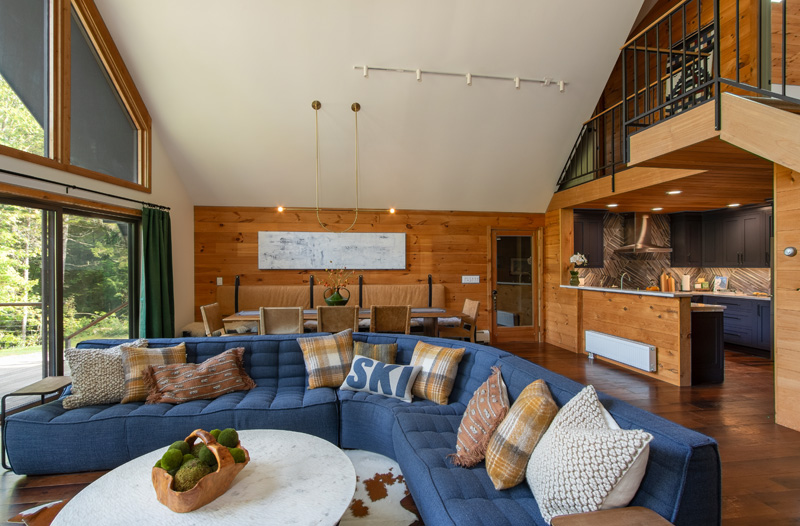
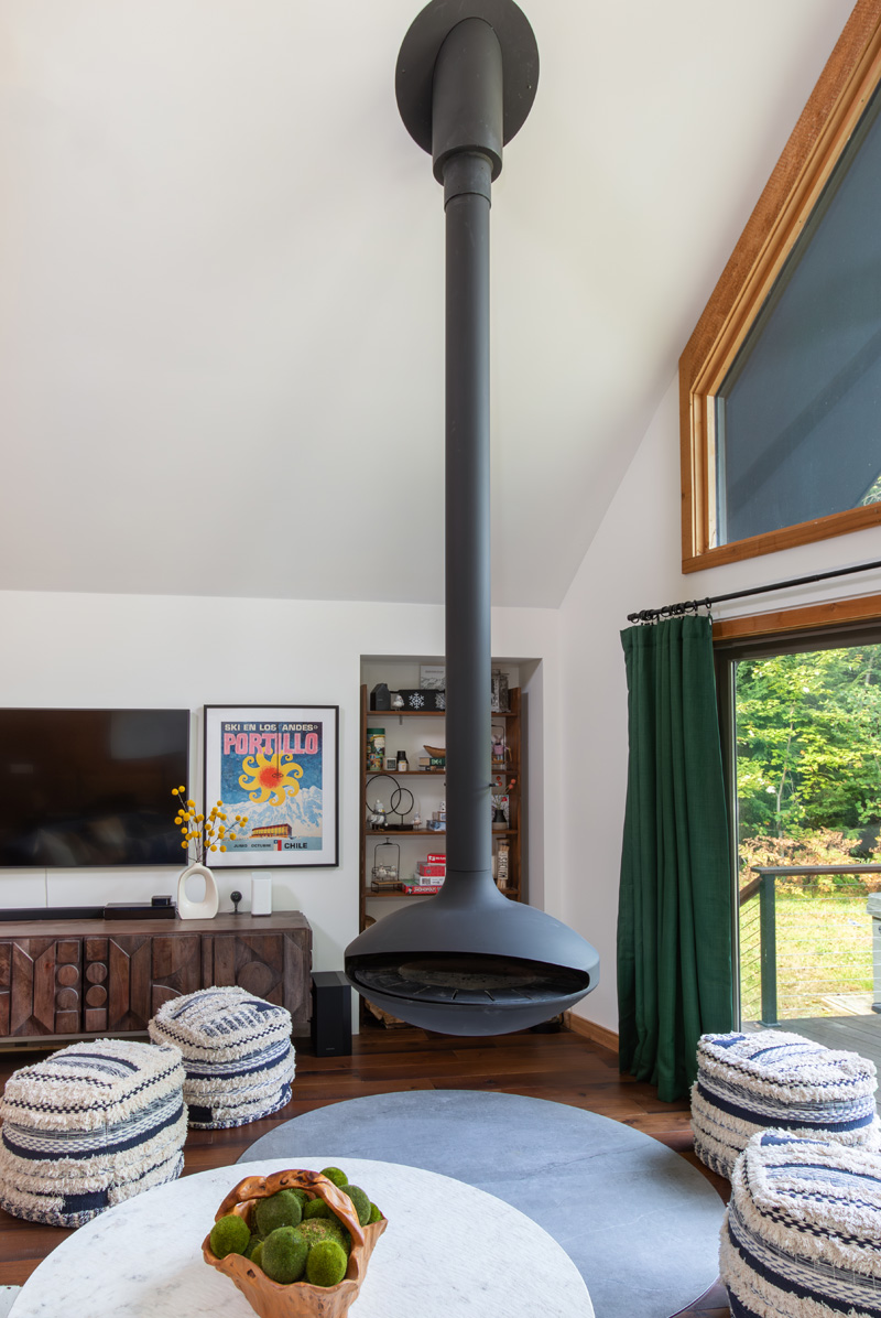
The most difficult and defining feature of the renovation was the fireplace.
As a designer, when a client says they “might” want a floating fireplace—you lean in and enthusiastically start researching, because that would be amazing!
But an item like this comes with challenges. Once we identified a model that worked for us visually— a wood-burning pivoting design with a pizza oven option— we needed to make sure the rest of the room worked around it. Though furniture layout normally comes later, we needed to ensure the fireplace had enough clearance from combustible materials, incorporate a fireproof hearth below, and ensure the space could still function as a living and dining space for a large group of family and friends. We didn’t want to push something so spectacular against a wall (it’s meant to float!) but the space, though open, isn’t huge for being dual function.
We started by identifying the two “wow” moments we wanted for the fireplace: through the front windows floating in the space, and right when you walk in the front door. Once we decided on the placement of the fireplace, we built around it. The client found and fell in love with the sectional in a shop window walking to work in the city, and because it’s modular, we were able to configure it perfectly to fit the space. The living room furnishings fell into place naturally from there; a round coffee table to mimic the shape of the fireplace, some tuckable side tables, and flexible ottoman seating meant this space could accommodate a crowd easily.
The most difficult part of the project? The fireproof hearth!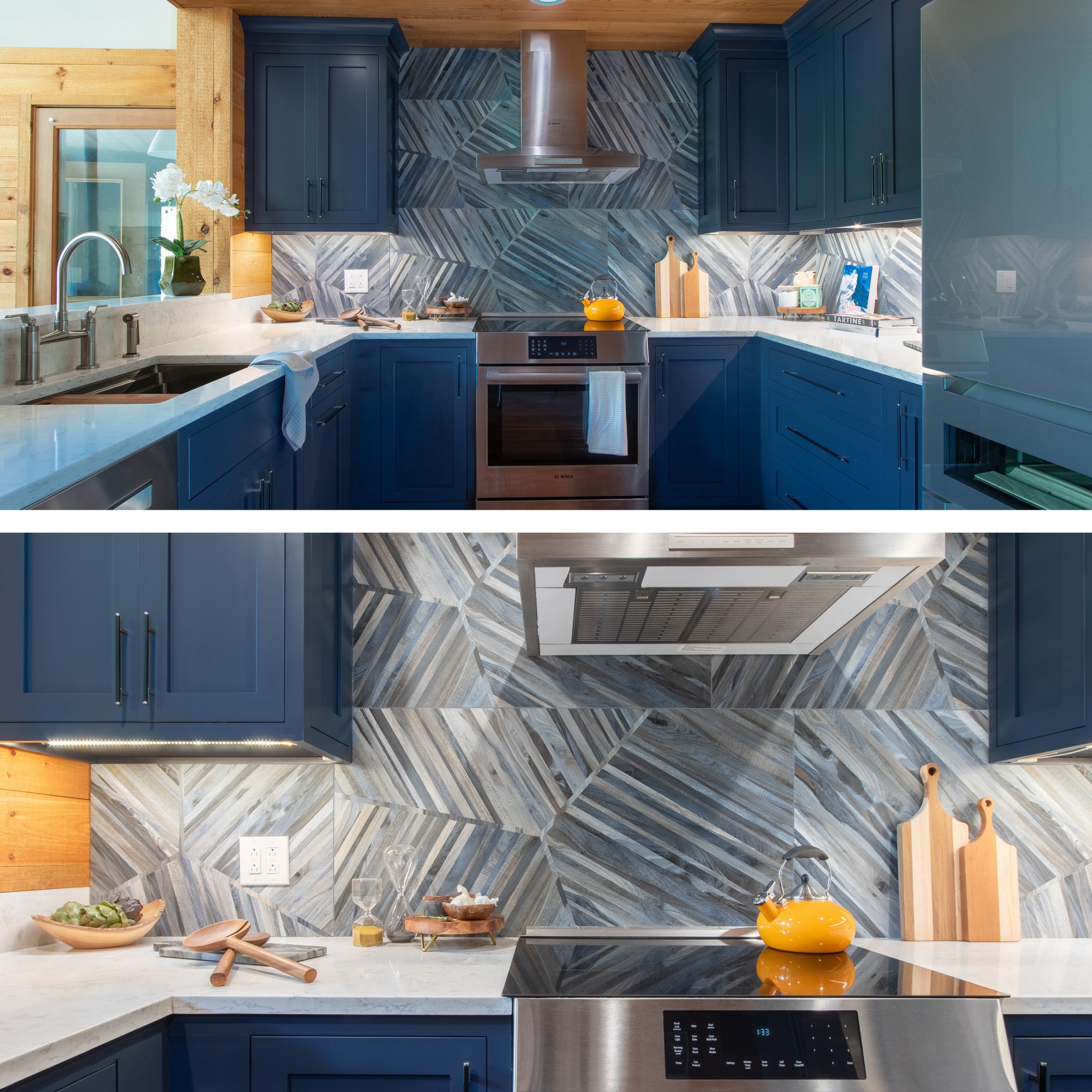
The client really wanted the warmth of wood floors, not tile, which is tricky when dealing with a fireplace like this. In order to meet safety requirements for the fireplace and protect the floors from any potential damage, we utilized Dekton, a porcelain-based quartz, to create a large heatproof circle. Because the hearth protrudes into the living space, we needed to ensure it was flush with the flooring to avoid it being a trip hazard, which was no small task. Once the floor was installed, we had the stone cut and delivered, took a template of the stone, then carefully cut out a circle from the floor with room for a slight expansion gap, and then set the stone into the hole and caulked the gap. We all held our breath until it was done, because at any point, a mistake could be catastrophic. You only get one shot to get it perfect with things like this (and luckily, we did!)
The living room also had quite a lot of impact on the dining room space.
The backside of the couch ended up a full 2 feet further into the dining side, so to allow for foot traffic through to the sliding door, we needed to seriously shrink the footprint of the dining space, while also somehow seating more people. We accomplished this by changing the configuration of the dining table to have a built-in banquette bench on one side, so that the table itself could be pushed closer to the wall, allowing for a path to the front deck. We ended up creating a 14-foot-long custom bench. The main radiator for the space was below the bench, so we needed to ensure the hot air could travel freely. We designed the bench to be built in alternating slats, to allow for as much airflow as possible. We skipped a bottom cushion and instead used sheepskins to not obstruct airflow, and on the rough texture of the wood behind, added wall mounted cushions (they are actually king-size headboards) to provide comfort.
To break up some of the warm tones of the paneling, back cushions, and wood table; some seriously dramatic art was needed to contrast, so we worked with Helmholz Fine Art to find just the perfect piece. A long expansive canvas of expressive pallet knife work – Margot Nimroski’s Thin Ice—creates the perfect contrast against rough wood. Its wintery subject matter feels just right for a ski home.
We needed a chandelier for the dining room. We landed on the perfect piece from one of our favorite small lighting designers, Katy Skelton. The curves, simplicity, and design of their fixtures felt like a great compliment, while the delicacy of the thin metal juxtaposed the bold thick lines of the fireplace. Instead of going with black, like the rest of the light fixtures in the home, we intentionally decided to go with a brass finish so that it didn’t compete with the fireplace, and instead played a great supporting role.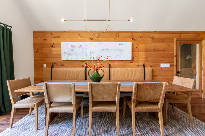
In the kitchen, the client fell in love with the geometric rustic wood-look tile we pulled for the backsplash, and we used that as a jumping off point for the rest of the details. We kept it simple, with Midnight Blue cabinetry (which feels like a neutral) and white marble-look countertops. We prioritized creating as much closed storage as possible, so that they could really utilize every bit of space, and we took the cabinetry all the way up to the ceiling to make it feel a bit taller. Normally, we eliminate the raised bar counter on peninsulas for a modern single height look, but in this kitchen, you walk right in the door to the peninsula, so we decided to add that! It created a nice visual shield from the sink area, as well as a great buffet space on the raised bar. We were fortunate enough to have a massive footprint to play with for the primary bathroom, but the space had odd proportions, so setting it up in a way that made sense was a challenge. She wanted a big soaking tub, he wanted a big shower, and there was space for both… but every time we added the tub to the design, it just looked silly, small, and randomly placed. Finally, a lightbulb went off! The last time I’d browsed Japanese Soaking tubs for a client with a small space, I’d seen a 6-foot-wide tub and laughed, thinking, “Who has space for that?” Well, WE did! And that totally made the design. Our silly little soaking tub was suddenly the big, fabulous, centerpiece in the room, though we did have to upgrade the water heater to be able to fill it!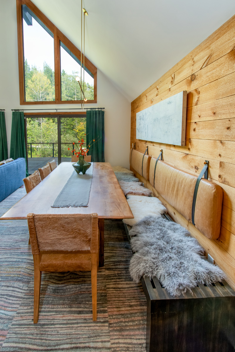
We continued the blue cabinetry and marble-look stone our client loved from the kitchen to the master bath, bringing the fun with some cool, colored industrial mesh sconces and bold patterned floor to add interest. Because there was so much wall space in the room, and our selections were cool-toned, we were worried if we stuck to the clean white walls we used in most of the house, it would feel like a big white box. We decided to add rough-sawn wood paneling, which already existed in the house, to keep it feeling cozy and add texture. We ran it vertically to emphasize the ceiling height, and we lightly sanded the rough-sawn texture for comfort.
In the guest bathroom, we had some extra fun. For the vanity, we chose a bright furniture style piece, with open storage below for towels, in our signature “Dorset Gold’’ finish. We used the same rounded rectangular mirrors throughout all the baths for their simple minimal forms. I love how the frame almost begins to blend with the wallpaper. We utilized a wallpaper collection by photographer Gray Malin in collaboration with Mitchell Black in a few areas of the home. We love how “quiet” they are in comparison to other wallpapers, while at the same time, they have so much interest and detail. Having selected clean white walls throughout the home, we didn’t want something that was going to be jarring against it, so the snowy white field of his winter themed design was perfect. From a distance, they read as white, but as you get closer, you delight in discovering the details of the tiny aerials of skiers or trees. In the bathroom, the ever popular “Birch Trees” paper was the perfect way to tie in some of the brown tones we used in the tile flooring, with hints of blue and green picked up in the sconce, and nods to the rest of the home’s colors.
It may have felt like my childhood home when we started, but by the time we finished, most of the similarities had faded. What we created ended up being more special than I ever imagined. It has plenty of personality, but still feels cozy, comfortable, and stylish.
Who wouldn’t want to spend the weekend in a space like that?
ALL THE DETAILS
DESIGN & CONSTRUCTION BY NORTHSHIRE LIVING
NORTHSHIRELIVING.COM
THIN ICE BY MARGOT NIMROSKI ON LOAN FROM HELMHOLZ FINE ART
HELMHOLZFINEART.COM